Best practice for images
Adding an image to your website is quite simple.
<img src="/apple.jpg" />
Let's pack our bags and go home.
But there are more things you should think about for a better user experience and performance improvement. Let's go through them one by one.
Alternative text
The alt attribute should be used for a textual description of the image. This is used by screen readers, so it's really important for accessibility. It is also displayed if the image can't be loaded.
<img src="/apple.jpg" alt="A green apple" />
If your image is only decoration and doesn't provide any value to the content you should set an empty string, alt="".
Figure
<figure> is an element that represents some self-contained content, optionally with a caption. It's often used with an image where we want a caption for the image.
<figure>
  <img src="/apple.jpg" alt="A green apple" />
  <figcaption>Largest green apple discovered</figcaption>
</figure>
Vector images
If your image is a Scalable Vector Graphics (SVG), you should keep it in that format instead of serving something like JPEG or PNG. That way your image can scale better to different sizes, also when the user zooms in, and there is less data transferred over the network most of the time.


Here is an example where you can see the difference in byte and how it looks if you zoom in.
Extra tip, you can use svgomg to clean up your .svg file.
Compress your image
This is the easiest measure you can do to improve your performance. You probably want your users to view the images in the best quality, but at what cost and is it necessary? If you serve an oversized image only to be viewed in a limited-sized box, you transfer unnecessary data over the network that take extra time before it can be displayed. I recommend you use a tool to resize and compress your image, e.g. Squoosh.
Avoid layout shift
Layout shift is when you think the content is loaded, but suddenly there is a jump because of a new element or an element changing height. Images typically do this, since they take up 0px until the source is loaded and the browser knows the actual height.
If you know the image size and the space it will take up on the page, you should set the width and height.
<img src="/apple.jpg" height="200" width="150" alt="A green apple" />
But often we do not know the exact space it will take up, because you have a dynamic layout that depends on the screen size. If you know the aspect ratio of the image, then that solves the problem. aspect-ratio: width / height.
img {
  aspect-ratio: 3 / 4;
}
But if you don't know that as well, you should set a sensible minimum height you know the image won't be smaller than.
img {
  min-height: 100px;
}
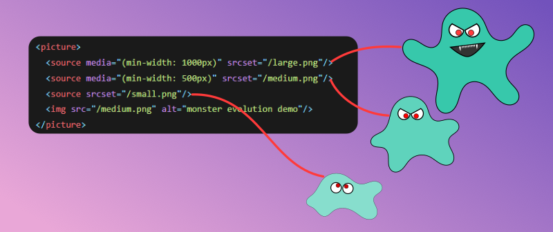
Different images for different screen sizes
Would you serve the same image to a mobile phone and a large external monitor? Probably not. The <picture> element can help with that, it will pick the first <source> that matches its criteria. <img> is used as a fallback and the place you put common attributes.
There are two approaches, either with media or sizes.
The media attribute accepts a media query and if true the source is valid to be shown.
<picture>
  <source media="(min-width: 1000px)" srcset="/large.png" />
  <source media="(min-width: 500px)" srcset="/medium.png" />
  <source srcset="/small.png" />
  <img src="/medium.png" alt="monster evolution demo" />
</picture>

Now try to resize the window and see how the monster evolves and devolves.
Modern image formats
There are some new image formats with better compression than JPEG and PNG, such as WebP, AVIF, and JPEG XL. You should check out the browser support on Can I use (WebP, AVIF, and JPEG XL) and choose accordingly. Again you can use Squoosh to convert your images and see how much you save.
<picture>
  <source type="image/jxl" srcset="/image.jxl" />
  <source type="image/avif" srcset="/image.avif" />
  <source type="image/webp" srcset="/image.webp" />
  <source type="image/jpeg" srcset="/image.jpg" />
  <img src="/image.jpg" alt="" />
</picture>
Modern image formats can be combined with how we served different sizes for each format.
Loading strategy
Should you load an image you might not need? Maybe, but you can use the loading attribute to not load all images eagerly. The default value is eager, so there is no need to specify that. But if you want the image to be hidden from the preload scanner and only load once it's about to enter the viewport, setting loading="lazy" is good.
The browser is smart about the fetch priority of images, but it can be improved if we gave it some hints. If we say nothing it can end up being low, high, or both. But if you want the image to skip a few places in the loading queue you can set fetchpriority to high. If the image is not that important you can set it to low so other requests can take priority.
We can also use decoding to change the prioritization of processing our content. You can leave it blank to let the browser know best. But if it's important to show the image early you can set it to sync. If it's okay to process other content before or at the same time as the image you can set it to async.
Putting it all together. If the image is your largest contentful paint (LCP) or the image is "above the fold", meaning it's visible without scrolling, you might want this code.
<img src="/apple.jpg" fetchpriority="high" decoding="sync" alt="A green apple" />
If the image is "below the fold" or not that important, you might want this.
<img src="/apple.jpg" loading="lazy" decoding="async" alt="A green apple" />
At last, what if your image is not found by the preload scanner because the image is client-side rendered by JavaScript or a background-image in CSS? You can fix this by preloading the image.
<link rel="preload" as="image" href="/apple.jpg" />
Caching
If a user is returning to a site, there is no need to re-download the same images. You can cache your images through a service worker. But probably the simplest way is to let the browser do it for you through Cache-Control in response headers. This can be configured by your hosting provider or your server. You set the max-age in seconds for how long it is okay to reuse it and immutable to ensure it's used. If your build step adds a hash to the filename you can set max-age to the highest supported value, a year, otherwise use a sensible value.
Cache-Control: max-age=31536000, immutable